top of page

Helping riders further their wellness, recreational
and fitness goals in the existing bikeshare app
Making New York City's bikesharing app accessible for more users


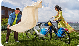
CitiBike is the US’s largest bike share program, with 25,000+ bikes and over 1,500 stations within NYC.
Members typically use Citi Bike to get from A to B, with access to classic and electric bikes.
The Challenge
Citi Bike’s model has largely unchanged since the birth of the program in 2013, and 50-60% of bikes are not being used at any given point throughout the day.
Historically and currently, riders mostly use the bike to to commute; With this in mind, there is an untapped opportunity to usher in an additional sector of recreational Citi Bike riders from right within the existing app.
How might we help users stay motivated while working towards their wellness goals and socialize with new people along the way?
The Stats
Role: Project Manager, UX/UI Designer (Freelance)
Team size: Three
Duration: Three weeks
Tools used: Figma, Figjam; Figma Slides, Slack, Shaker, Notion, Zoom, Voice Memos app. (*Chat GPT used in certain instances to assist in synthesizing research material.)
Methods used: Competitive + Comparative Analysis, User Research, Affinity Mapping, User Interviews, Problem Statement, Feature Prioritization/MoSCoW chart, User Persona, User Flow, Sketching, Low-fi, mid-fi and Hi-fi Prototyping, Usability Testing

Within a team of three, I led a UX/UI app implementation. Before we chose CitiBike, our initial goal was to try to figure out how we could help users stay motivated with their own wellness/fitness goals.
It became evident that Citi Bike is where we wanted to land BECAUSE of its untapped potential in this arena while users alresy use the bike to get from A to B.
The initial result from this sprint is a simulated integration we named CitiBike Discovery.
How the brief guided our scope of work
The project aimed to collaboratively design a solution that met both client business goals and user needs. Deliverables included work across the Discovery, Define, Design & Deliver phases, a presentation deck with appendix, and outcomes showing solution choices, alignment with business objectives, and user needs, all within a self-guided, professional project structure with set schedules and group check-ins.
The Project Brief
As a Project Manager, I led the team over three weeks in keeping the timeline on track and putting together a roadmap for each task needed, and divided up responsibilities when it came to overall project support, UX researching and UX designing.
As a Researcher and Designer, I conducted and synthesized a number of interviews and mainly focused on identifying hat users wanted when it came to fusing their fitness and social goals. I also led the creation of a portion of the hi-fi prototype’s user flow.
Opportunity Space

+

=

Expanding the stakeholder pool
(Event organizers +
small businesses +
non-profits +
community partners)
Growing ridership
& connections
(More users + more miles + more ways to meet people)
A happier, healthier
New York City
The Result: Feature Set

Discover curated nearby and hyper-local events to rsvp and ride to directly from
within the app
Track progress and achievements
through earning
personal badges
Chat with other
like-minded locals to meet up with at the event, and even ride along with them
if you choose
Earn and claim rewards tied to local business through your
riding progress
and achievements
click here for full screen experience
Prototype Preview:
RESEARCH
Scope of Work
Our research began by exploring people’s fitness goals and habits, then focused on motivations, pain points with current apps, and reasons they abandon routines. Early in the process, we weren’t committed to CitiBike, so we used mind maps to explore opportunities in the broader wellness and fitness space.

We then conducted a Competitive and Comparative Analysis, where we looked at many fitness apps,
such as Strava and Apple Fitness, and their communities. We learned how they manage user’s goals and motivations, what gamification methods they use (e.g.: challenges or milestones) and how we can adapt similar but unique features in our eventual prototype.
We really wanted to get to the core of the issues the users were having, and how to solve those problems...
This led us to our hypothesis where users need a social space that helps them connect and communicate around wellness/fitness goals.
- We assumed users are motivated by their shared fitness goals and milestones.
- We assumed users yearn to try new things, especially when it comes to exercise and fitness.
User Interviews / Affinity Mapping
Understanding current fitness/wellness app habits
Preliminary user research sessions with eight interviewees were conducted. This first round of User Interviews / Usability Tests were conducted virtually with a written interview script. Several standout insights emerged; highlights that inspired our thinking moving forward were:
“I definitely prefer a wellness routine where activities aren't repeated too much. Having variety is nice.”
“I don’t want to lose my progress.”
“I would love to be able to find new workout partners because it’s currently difficult to do so in the city”


Target Audience
Understanding the user
Once we started to see the above themes emerge (from user struggles with consistency, to how important external motivation can be), we came up with a real person in mind to further guide our design scope:
This helped guide the rest of the design process.

-
Likes to jog under the bridge in the park with his dachshund.
-
Enjoys doing activities with friends, but also values his alone time.
-
Is planning to run a 5k in a few months, but still has a lot of work to get in shape for it.
“The Forgetful Fitness Fan”
30, Brooklyn, NY
Sam L.
With multiple options at his fingertips, Sam loves to switch up his fitness and wellness routines in the city. He enjoys using fitness apps to track his progress, but he finds it a bit tough to stay motivated when sticking to a particular exercise/wellness routine.
Sam needs a consistent, simple way to plan and track a variety of routines so that he won’t struggle to complete long term wellness goals:
How might we help Sam...
...keep a consistent fitness routine?
...meet a new (built-in) exercise buddy?
...start a fitness routine in an easy way?
...consistently exercise in an affordable way?
...achieve his fitness goals in a non-traditional way?
...offer new activities to keep his adventures fresh?
User Flow - dont use screenshot liek beolow !
Our initial user flow incorporated many of the possible paths a user could take within our scope of work. However, our final prototype didn’t include every action. We realized we needed to narrow it down to a more focused and streamlined MVP.
Black line: Prototype Flow
Grey lines: Alternate ways one can interact with the integration


Where design efforts were focused
Now that we've learned more about who might use our eventual feature integration, and started to come up with a user flow, I came up with three core design pillars that helped our team have a clear roadmap to guide our prototyping phase:
Insights > Features

Prompt users with exciting local events they can RSVP and bike to.
Discover:
Help users stay on track with their wellness and fitness goals.
Motivate:
Meet:
A new to connect riders with similar interests
Platform
We chose iOS because:
-
According to AI, 80% of NYC dwellers use iPhones and its easier for them to update software on iPhone instead of android so it serves our target audience.
-
We also considered implementing some hardware features of the iPhone like GPS and geofencing.
CROP IMAGES
DESIGN

component library for our hi-fi prototype

Figma board of our hi-fi prototype - dont make it. screenshot!!!!!
Here, we saw how each feature compliments our pillars we distilled from our research, and validates our hypothesis and assumptions: We found there is demand for an app that focuses on wellness in a gamified way, and that the social motivation is a key driving force in their ability to keep up. Based on these takeaways we are confident that our app concept provides a valuable product.

Track Progress
Discover Events
Chat & Meet
Earn Rewards
Usability Testing
Testing the new prototype with potential CitiBike Discovery members
Our designs were then tested with five users. Key takeaways included:

Task Metrics
Testing the new prototype with potential CitiBike Discovery members
During testing, examples we identified where our design changes made the most impact were:
Example 1. Adding “Categories”
Another improvement came directly from user feedback: participants wanted clearer event categories toward the beginning of the user flow. Based on this input, we implemented a categorization system to help users browse and filter events more efficiently. This small but high-impact change enhanced discoverability and overall satisfaction.
Example 2. Splitting the “Continue” Button
A major priority was improving ease of use and ensuring a smooth screen-to-screen flow. In testing, we noticed an issue on the event confirmation screen: users often overlooked the option to message other attendees. Without a clear prompt, many assumed no messaging functionality existed. To address this, we redesigned the interface to make the messaging feature more visible and distinct. This allowed users who wanted to connect with others to do so easily, while solo users could continue directly to the event.

Closeout
Over the next six months, we anticipate launching a full integration with Citi Bike, supported by Lyft, with the following
top-level next steps:
-
Refine with developers to build feature sets + back end infrastructure
-
Pull in Citi Bike’s partnerships team to formalize listing events
-
Continue development and implement API’s to plug in partnership data
-
Beta test for user testing and market product before public launch
Additional features may include daily challenges, personal fitness goals, integration with CitiBike’s existing Bike Angels program, and the introduction of voice chat and soundboards. Following that release, our focus would shift toward enhanced tracking and user engagement.
IMPLEMENTATION & NEXT STEPS
CitiBike Discovery validated our feature focus points and most of our research assumptions, leading us to believe it will be an extremely effective and valuable addition to CitiBike's bottom line.
Perhaps most of all, the positive reception from users, was broadly:
"I wish this was ready to use tomorrow!"
Below is a full list of daily completed tasks, with myself as a project manager for the full duration:
-
Established ground rules and a team charter to align on values and expectations. We evaluated multiple project directions, submitted two proposals for approval, and ultimately narrowed our focus to two ideas (a social wellness app and a retail app as a backup). From there, we began mapping out potential features of the wellness app with a mind map.
-
Finalized and distributed our screening survey to 12+ participants, completed a preliminary feature inventory of competitor apps, and conducted a practice interview with a classmate. We also completed two initial interviews, capturing recordings and notes, and set up a shared Figma workspace to centralize our collaboration.
-
Conducted and documented eight user interviews, while continuing competitive and comparative research on apps mentioned by participants.
-
Defined our problem space and key assumptions, completed affinity mapping, and drafted “I” statements to capture user needs and perspectives.
-
Synthesized our research findings, developed a primary persona, and identified the app integration that best aligned with user needs.
-
Completed our synthesis phase by ideating potential features, mapping them on a MoSCoW chart and priority matrix, crafting “How Might We” statements, and producing our first user flow.
-
Used feedback to break down the user flow into three core tasks for usability testing. We sketched solutions, assigned ownership across the team, and began building mid-fidelity prototypes.
-
Developed the first iteration of our mid-fidelity prototype, dividing it into two usability testing tasks. We also drafted our testing script and explored potential enhancements for the high-fidelity stage.
-
Synthesized insights from usability tests, identified the most essential features, and began refining our prototype to high-fidelity standards. We revised our usability testing plan and started building out presentation slides.
-
Advanced our high-fidelity prototype, refined the content for our presentation, and conducted usability tests with users (though recruitment was more challenging at this stage).
-
Completed the high-fidelity prototype, finalized presentation content, and ran the final round of usability tests (five in total).
-
Streamlined and refined our presentation slides, including the usability testing scorecard, and rehearsed extensively to prepare for delivery.
-
Finalized all graphics and layouts for the slides and completed additional rehearsals ahead of our final presentation.
Reference
Appendix link: Group Figjam Board (Reference individual pages)
bottom of page